
How to Choose the Perfect Downlight Finish
How to Choose the Perfect Downlight Finish
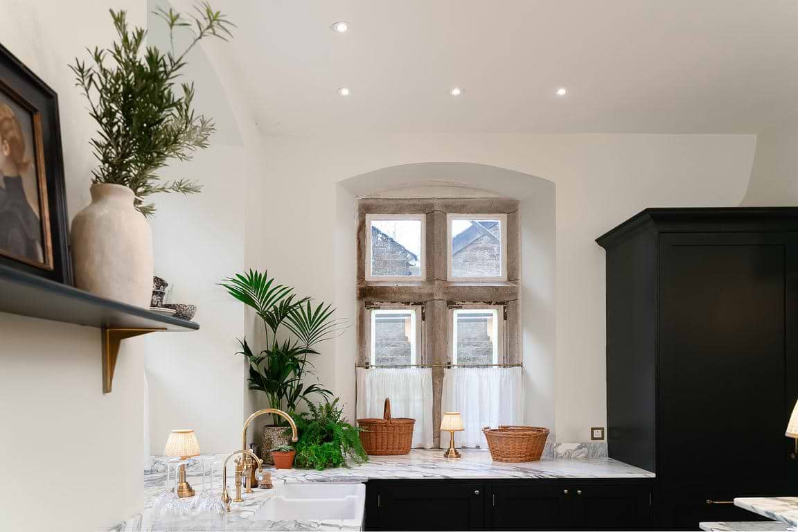
When it comes to beautifully crafted interiors, the smallest details often make the biggest impact - and downlight bezels are one of the most overlooked. Chosen well, they quietly elevate a room. Chosen poorly, they break the flow with distracting dots of contrast. This guide simplifies the art of pairing bezel finishes with paint colours, ceiling treatments and interior styles - your shortcut to ceilings that feel intentional, cohesive and effortlessly luxe.
White: The Clean, Quiet Classic
White bezels are a timeless choice, working beautifully with white, warm‑white and off‑white ceilings, as well as soft, neutral palettes. They suit interiors styled in a modern, Scandi, coastal or classic direction, and are a hallmark of quiet‑luxury schemes. Their strength lies in their ability to visually dissolve into the ceiling, avoiding the “polka‑dot” effect that can disrupt a room’s flow. Because they reflect more light, they also help the ceiling feel calm, bright and uninterrupted. Choose white when you want seamless simplicity and lighting that disappears effortlessly into the architecture.
Paintable: The Architectural Favourite
Paintable bezels work beautifully with colour‑drenched ceilings, heritage hues, deeper tones and moodier palettes. They are particularly suited to architectural interiors, boutique‑hotel styling, period renovations and design‑led homes. When the ceiling isn’t white, a standard bezel almost always introduces unwanted contrast; a paintable downlight instead blends seamlessly into the ceiling colour, creating a refined, custom finish. Choose this option when your ceiling colour is part of the room’s narrative and you want a curated feel. It remains the go‑to choice for designers seeking an elevated, considered scheme.
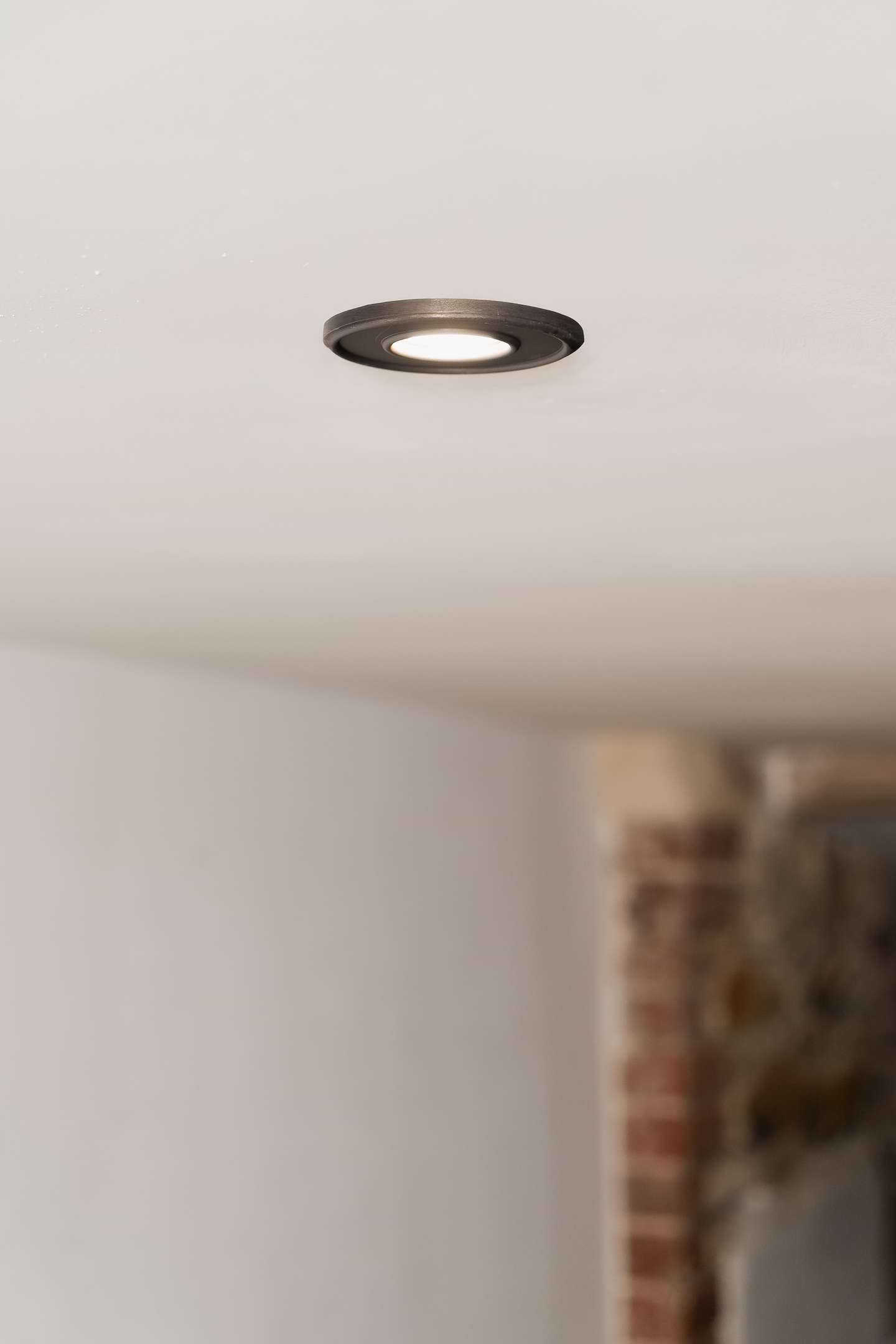
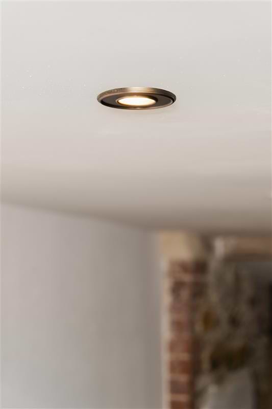
Matt Black: The Graphic, Modern Statement
Matt black downlights work beautifully with white ceilings but only when black is echoed elsewhere in the scheme, and with dark ceilings where you want a subtle, tonal effect. They suit interiors styled in industrial, contemporary, monochrome, minimal and modern farmhouse styles. Matt black offers graphic punctuation and a confident modern edge, and its sleek presence feels most at home when the room features repeated black accents for balance. Avoid this finish in warm, soft or traditionally styled schemes where no other black details appear.
Brass & Antique Brass: The Warm, Luxe Touch
Brass and Antique Brass pair beautifully with warm whites, creams, taupes, plaster tones, olive greens, navy and jewel colours. They are perfectly suited to classic, warm modern, boutique, English heritage and transitional interiors. Warm metals bring richness and a subtle glow, and brass bezels instantly elevate a room, particularly when placed near tactile finishes such as linen, polished plaster and natural stone. Choose brass when your home already incorporates warm metal details, or when you want to build a cohesive, luxurious metal story throughout your rooms.
Brushed Chrome, Polished Chrome & Pewter:
The Cool, Crisp Choice
Cooler metallic finishes work beautifully with crisp whites, cool greys, blue‑greys and marble‑led schemes. They complement contemporary, modern and refined traditional interiors, as well as fresh, clean kitchen and bathroom designs. These metals excel in cool, airy palettes, introducing clarity, brightness and precision, ideal for marble bathrooms, coastal‑cool kitchens or modern grey interiors. Do note that they can feel abrupt in earthy, clay‑based or very warm rooms unless balanced carefully within the wider scheme.
Bronze: The Earthy, Grounded Neutral
Bronze works beautifully with warm neutrals, mushroom, tobacco and terracotta tones, as well as deep greens and timber ceilings. It suits rustic, Mediterranean, and warm modern interiors. For those who want depth without the lustre of brass, bronze provides a grounded, understated alternative. It pairs effortlessly with timber and nature‑inspired palettes, adding warmth, texture and balance without the harsh contrast that darker, cooler metals can introduce.