
Why Does Paint Look Different In Different Lights?
Why Does Paint Look Different In Different Lights?
During home renovations and general DIY, we spend so much time choosing furniture, decor and hours comparing different paint swatches which almost always look the same colour! But we don't give a second thought about the right lighting that we need to show it off. When really, choosing the right lighting is key in helping you to get the most out of your home. It's the one element that helps pull everything together.
We're not talking about light fixtures either, although, choosing those is just as important.
When have you heard yourself say the words 'let me look at it in daylight'?. It's all about CRI, colour rendering index. CRI is the measurement of how colours look underneath a light source when compared with sunlight. It reflects the true colour of objects in the room. We discuss the pivotal role of CRI and why paint really does look different in different lights.
Differing CRI's - What They Represent
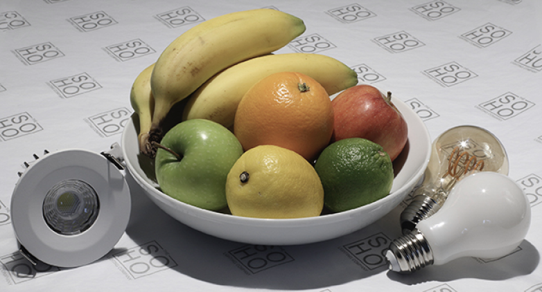
Pictured below are 3 different CRI levels, on first glance you can see the different impact they have on the colour of the objects. Imagine how it can distort the colour of your paint!
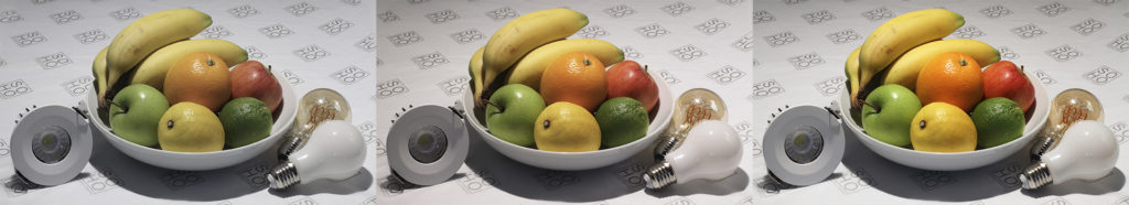
CRI 97 - Right Image
The far right image features a CRI of 97. This is the highest CRI level which reflects a truer representation of the colour, it provides more clarity and is the ultimate lighting for precision and accuracy, no matter what the room is and what tasks they are used for. Having a light with a CRI between 97-100 will ensure that the paint you see on the walls, is the paint you get.
CRI 93 - Middle Image
There might not seem like a huge jump between CRI 97 and 93, whilst there isn't in numerical sense, it will make a difference to how you see your paint. Anything with a CRI of 97 and under does not reflect the true representation of the colour. This CRI level is still deemed as 'good' but it will make a difference to the colour on your walls. As you can see from the image, you're starting to lose the clarity slightly of the objects and they are surrounded by a more orangey/aged effect.
CRI 80 - Left Image
Anything with a CRI of 80 and below offers a poor colour reference. The clarity of the colour has decreased and further definition has been lost. You can see the stark difference between the left and the right image just by a quick glance. The colours are less appealing, they aren't bright, there's no clarity and everything just looks dull!
Imagine having a gorgeous paint colour on your wall and then switching on a light with a CRI of 80! So, that paint on your walls which you think looks 'dull' is probably not anything to do with the paint.
Choosing The Right Paint Colour
When choosing a paint colour for your home, don't fall foul to the tricks of CRI. We recommend having a colour swatch in the room with the light on to see the reflection of the colour. Opting for lighting with a high CRI will not only benefit your paint, but everything else in the room too.
This is a very important aspect, you don't want to be in for a shock when the entire room is painted and you finally switch on the lights to realise, it actually looks completely different! This handy tip will help you to choose the perfect shade for any room.
As you can see, CRI plays a hugely important role in both the paint colour and the objects you hold in your home. When choosing your lighting always aim for lighting with the highest CRI as possible for clarity and definition.
CRI is the one thing that can go silently unnoticed in the interior world, but it's one that would answer a lot of questions. When you're next planning on repainting your home, don't forget CRI, turn the lights on first with your swatch! Swatch, lights, check CRI.